Thu, January 17, 2008
Designing the Pool
The Academy of Motion Picture Arts and Sciences (or, NAMBLA) has unveiled the official poster for this year's Oscars – steadfast in their resolve to never admit even the possibility that this year's ceremony might be affected by the WGA strike. I pay attention to this sort of thing because the nominations for this year's awards are announced on Tuesday and I'm hoping to have the annual onebee.com Oscar pool open for business sometime that same day.
For no reason other than tradition, the design for each year's Oscar pool web site is typically inspired by the Academy's official poster. Okay, there's one other reason: I'm the kind of ridiculous geek who takes that kind of thing way too seriously. My Oscar pool ballot accidentally ended up looking a lot like the official poster nine or ten years ago, so when the time came to make the onebee.com Oscar pool, I decided to keep it going. For the sort of person who makes sure every nominee in the Sound Mixing category is accounted for and in the right order, this sort of aesthetic synergy is practically a no-brainer.
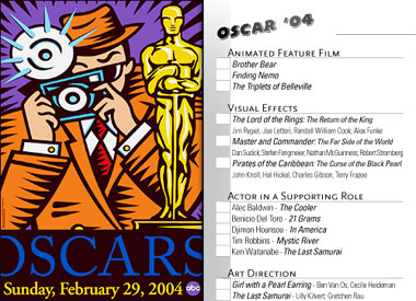
A quick Google search didn't reveal the earliest poster, but the computerized Oscar pool we know and love began in 2003 (meaning it actually predated the onebee.com we know and love). We didn't have online voting in those days, but here's the official poster and the ballot that was gently inspired by it.

(I got lucky and they used the Eurostile typeface which was readily available, so I matched it.)
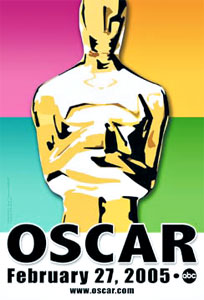
The following year is one of the ugliest posters in Oscar history – and just from the ones on this page, that's a steep climb. The poster in 2000 was pretty godawful, and the one in 2002 which heralded Oscar's return to Hollywood was pretty bad, with its failed attempt at art deco themes. Still, this one takes the cake. Since it was so ugly, and I was so short on page space (Stupid LOTR!), I just picked a goofy comic style typeface and went with that.
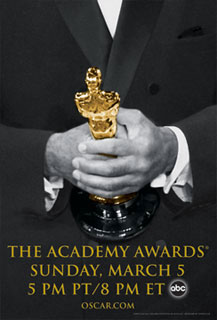
Then we added the online voting, so the ballot – while crucial – was no longer the main focus of the pool, or my design work on it. Most votes were entered directly to the Oscar pool web site, so the welcome screen for that site took its inspiration from another very ugly official AMPAS poster.
The Oscar pool leaderboard was projected across a wall of Andy's apartment – as always – and rather than project nothing while we munched guacamole and waited for the show to start, I projected a "splash" screen which drew its inspiration from the online welcome screen, which in turn was based on the poster. Lined up in a row, the Oscar statuettes looked like a shooting gallery to me, so I grabbed the little spinning heart from the shooting gallery scene in Back to the Future Part III and put it on each Oscar along with the head of someone I was hoping would lose that night. (I have nothing against Charlie Kaufman specifically, but he was up against Brad Bird for Best Original Screenplay that year. For The Incredibles.)
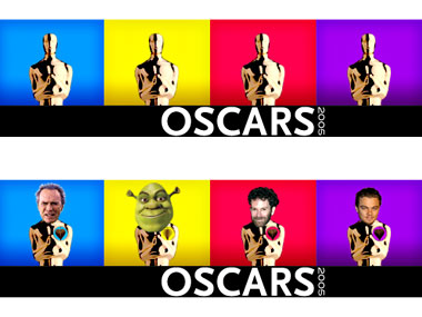
In 2006, the Academy embraced its history, cropping old photos of award winners holding their statuettes. Pretty classy. I followed in lockstep for the Oscar pool website, then crafted my own splash screen image in the same "hands-photographed-in-black-and-white" style.
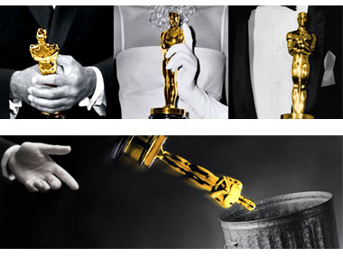
Crash, Brokeback Mountain, and The Constant Gardener were up for awards that year – aside from Amy Adams in Junebug most of the nominations essentially amounted to throwing Oscars in the trash.

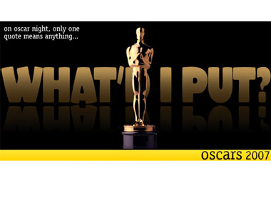
Last year, Oscar once again looked to history, cluttering up its poster with dozens of "memorable" quotes from well known films. I considered cluttering my image with dozens of other quotes – lines the Oscar pool voters would clearly recognize, but didn't come from movies the Academy likes to fawn over. My favorite would be Sam Jackson's "Hold onto your butts," from Jurassic Park. But in the time I had available, I couldn't come up with enough quotes to clutter the background like AMPAS did, so I focused on just one quote: "What'd I put?" For those who've been following along, "What'd I put?" is pretty much the quote that singlehandedly launched the onebee.com Oscar pool into existence, so it seemed fitting.
So, this year's poster is out, and it's just as ugly as ever. It looks like someone's kid went nuts with the default "lens flare" filter in Photoshop (and according to AMPAS's description, perhaps that's exactly what happened. What, no Pillow Emboss?

I'm not sure yet how I'll incorporate this poster into the Oscar pool design, but I've got a few more days to figure it out. My first thought was that each burst of light should represent the Internet residuals of a different WGA writer vanishing into thin air, but that sort of thing is kind of hard to convey in a still image.
Still, the show must go on (unless it doesn't), so I'll be sure to think up something good by Tuesday.

