Sun, November 8, 2009
Devastation: Anywhere
Last time, I thought it was tough to show Stu looking excited without resorting to cliché actions, but now it's getting really challenging: they want him to communicate devastation in just a single pose. If it sounds easy, it's not – especially when your character doesn't have a face. After this, we've got a few weeks off – no poses due, only animated clips – but I worry about the level of difficulty when the poses resume. ("Show Stu being exactly 11 minutes late and thinking about a pain in his right shoulder which has almost gone away but not completely.")
Devastation is one of those emotions that would be easy to demonstrate with a few seconds of animation for context, or with some facial features; but in a static pose, it's easy to get confused with anything from exhaustion to bewilderment. (I even ended up with one sketch that just looked like Stu was really thirsty.)
I've been lucky enough to have limited personal experience with devastation, and none that lent itself to particularly clear poses with strong silhouettes. The first thing that came to my mind was Private Ryan's mother receiving the news of her sons' deaths in Saving Private Ryan. She teeters, her legs unsteady beneath her as her body reacts, then steadies herself against the door frame. I sketched the pose from memory, which resulted in the following 3D pose.
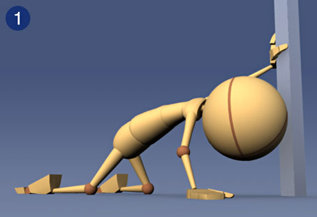
Of course I re-staged it so the action is facing camera – I learned in week one that it's ill-advised to put the camera behind the subject without good reason. Spielberg had good reason, but I didn't. I like this pose a lot, but it's hard to ignore the sense that Stu is searching for a lost contact lens. Looking for pointers on how to make it stronger, I popped in the Saving Private Ryan DVD and looked at the actual scene. Here's the pose I thought I had remembered so strongly:

See? It's hard to get across "devastation" without context! In this case, the beautiful slow build of the car coming all the way up the road; the mother's shallow breaths, and the hesitant steps she takes through the doorway; and, above all, John Williams.
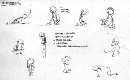
I headed to gettyimages.com to compile a library of devastation poses from stock photography and news images, then sketched a few of the most interesting things I found. I also came up with some elements that seemed common to almost all poses of devastation. As much as we animators wanted to shy away from the cliché of dropping Stu to his knees with his hands on his head, that was pretty popular. The cliché is there for a reason – it works. It's what you do when life socks you in the gut. In order of popularity:
- Hands on head, forehead, or face.
- Body crumpled, huddled, or curled up.
- Shoulders hunched.
- Weakened posture – on the ground, or leaning on something for support.
- Body "tucked in" – like the fetal position, even if sitting up.
One thing that was important to me was avoiding the use of props. It's one thing to have Stu leaning against a wall or sitting on a stoop, but I've seen some students who depicted excitement as "Stu is excited that his team is scoring a touchdown on TV" or devastation as "Stu has received a devastating phone call." I think if our instructors wanted us to tell a whole story, they'd have asked us to do that. Instead, they're asking us to use a pose to communicate a certain emotion, not an entire scene. I admit I've used a little color to set the mood, but I think using props to give the pose context is cheating – if it's not clear what's happening from the pose, that pose isn't good enough for an assignment that's only about posing. As the orientation videos stated repeatedly, this isn't Rendering Mentor – if your portfolio reel has shots with fancy lighting and special rendering, that just means you took time away from animating to do those things. Taking time away from posing to add props is the same thing. I mean, really, this assignment goes from challenging to super-easy with the addition of one seppuku sword, but then what have you learned about bringing an animated character to life?
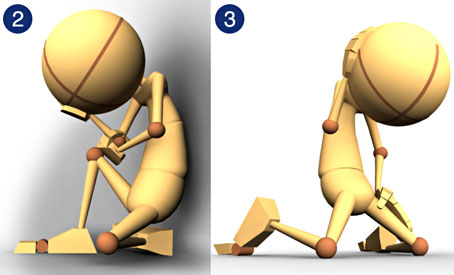
Working on previous poses, I've learned that my greatest difficulty is getting locked into a particular "staging" too early. This refers to the way the pose is oriented to camera, and the specific way that each gesture is accomplished (i.e., there are dozens of way to say, "Stu's right hand is resting on his right hip"). Rather than try to perfect these nuances on paper, where my drawing skills are rudimentary at best, I decided to get a few favorite sketches into 3D space early, then experiment with different camera angles and other options rapidly to find the strongest silhouette and identify any alignment issues that would otherwise crop up at the last minute.
A couple of options for a slumping Stu.
One option for keeping Stu's hands off his head, but at the expense of silhouette clarity.
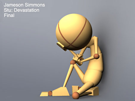
In the end, with copious feedback from my classmates and my girlfriend, I narrowed it down to the second pose from my list. Certain parts of the others may have been stronger, but #2 seemed to be the clearest overall. I fixed some issues with his left foot and lowered him to make sure he was believably seated on his curled-up leg, and submitted the following pose for my assignment.
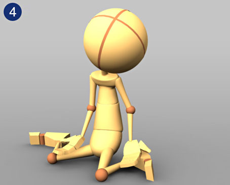
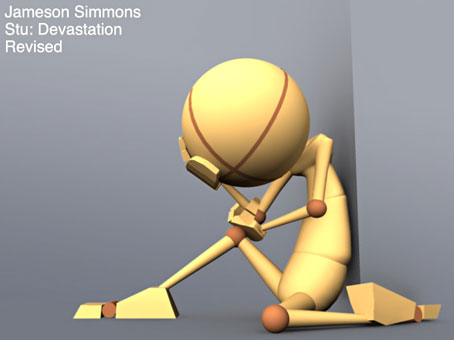
My mentor came back with some excellent suggestions for further refinement. He was a fan of the pose overall, but thought the silhouette could be stronger – even with three limbs clearly defined, why not go for four? He also suggested that moving Stu's right foot forward would create a stronger "triangle" between his hips, foot, and head/eyeline, which is another of those concepts we bring up a lot when discussing poses. It helps draw the eye to the important parts of the image. My mentor also thought the left arm would've been stronger draped across Stu's stomach, rather than cradling his opposite elbow. Perhaps, but I really like that element of my pose – inspired by some of the strongest photos I saw in my research – so I left it alone. Art is subjective, after all. Anyway, here is the revised pose, which I do believe is a stronger way of communicating the idea.
Thanks for reading – animated clips coming soon!


© onebee · all rights reserved
"Kat" — Wed, 11/11/09 12:39pm
I like the back foot moved out- it really seems like Stu just slumped where he had been standing, at a loss to do anything else in the face of devastation. That seems to be what stuck with you from the Saving Private Ryan scene, and definitely conveys devastation its much milder cousin, sadness.